

 .Zohvib")
There’s something odd about search engines.
Google owns 85% of the market. Yahoo has 2%. But there is no difference in the quality of their results. Yahoo even had a head start. So why does everyone use Google?
Have a look at their pages and you’ll see why.
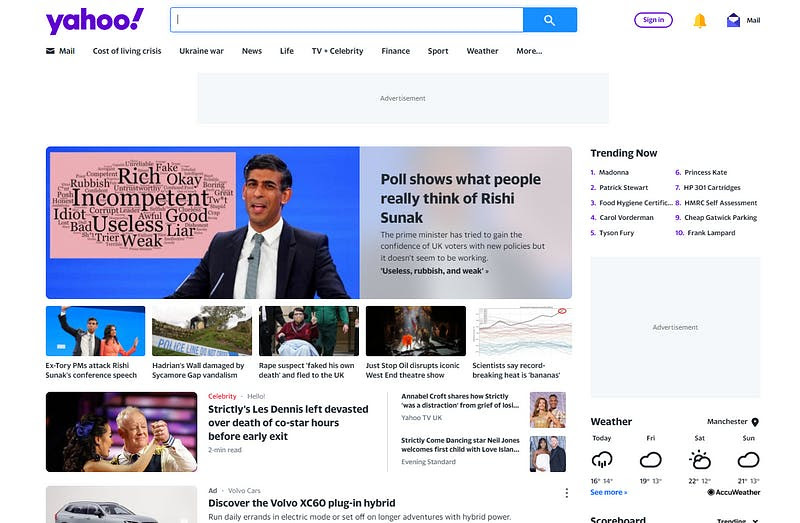
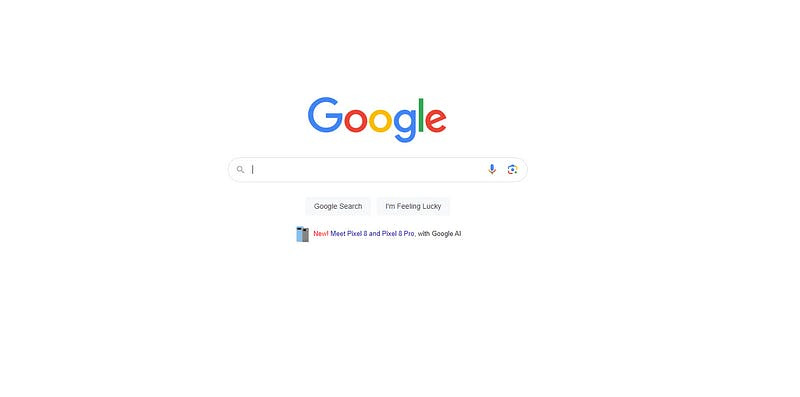
Google is easier on the brain. Less distracting and feels good to use. It’s why I feel the urge to go into an Apple store even though I don’t have any Apple products.
Beautiful design draws us in.
Your reader doesn’t just want content. They want writing that is easy on the eye. When I started I made the mistake of focusing on content. But I’ve discovered packaging is important too.
Hard to read doesn’t get read.
Step 3 in my writing system is to craft something that looks good.
Since those early clumsy attempts to write I’ve learned how to design a beautiful article. Reader's feedback tells me this has been key to my recent growth.
Here are my top 5 tips for enhancing your design:
1. White space
Central to the design is white space.
Don’t think of white space as a lack of content. See it as a powerful tool. It improves the reader’s experience and helps you communicate your message.
Using white spaces gives your writing 3 advantages:
Reduces cognitive load
It takes effort to process information.
Our brains are lazy. Anything easy gets more attention. Clutter overwhelms readers. Well-designed white space reduces this load by providing a clean visual structure.
Easy to read gets read.
Please the reader
White space makes your writing look elegant and visually appealing. A tasteful layout changes how readers perceive your content.
Look good and they’ll rate it higher.
Enables scanning
Nobody reads your writing.
People skim it. White space makes this easier. Headings and bullet points are key. These visual cues guide the reader through your writing. And encourage them to keep going.
If your writing isn’t easy to scan, most readers will ignore it.
So white space is essential. What tools can help design it well?
2. Bullets
Bullet points are a crucial weapon in the war for attention.
They offer a potent combination. Pleasing to the eye and pregnant with meaning. Whenever you write a paragraph with several points switch them to bullets.
For extra flair list them in size order.
Here's an example of mine:
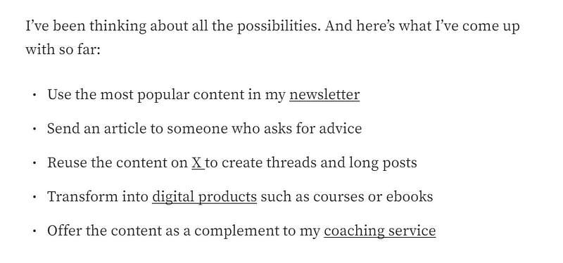
These 5 points are about how I reuse my Medium content. If this was a paragraph. It would be dense and take a lot of effort for the reader to wade through it. Bullets make it easy to digest. And gives space for the heavy content to breathe.
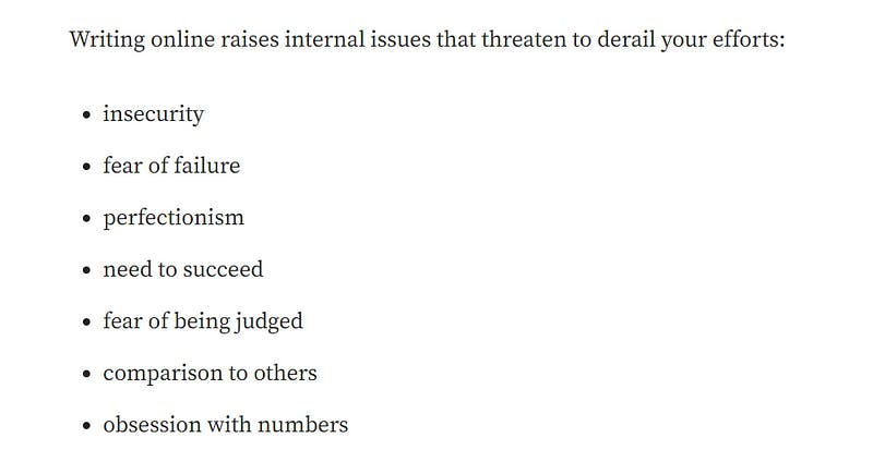
Here’s a very different list. It’s super fast to skim, with plenty of white space to the side. Notice how it encourages the reader to glide down the page:
3. Paragraph length
Paragraphs are the basic building blocks of your writing.
Unfortunately, writers treat them like building a house. With lots of same-size bricks piled on top of each other. This is a terrible idea.
Use these 3 ideas to create beautiful paragraphs.
maximum size
Big paragraphs block your reader.
When your reader sees a big wall of text, it feels exactly like that. A wall. Keep your paragraphs to 3–4 lines. Split big paragraphs in half or use the single-sentence strategy.
use single sentences
I was shocked the first time I heard advice to use single-sentence paragraphs.
But now they are my greatest friend. I start every article with a single strong sentence. Most sections begin and end with a single sentence too. This makes the design look better. Readers can’t resist reading a single sentence.
Give time to make your single sentence stronger in meaning.
variety retains interest
Your content is super interesting.
But using same-size paragraphs will make it boring. The brain is wired to notice differences and gets bored quickly with the familiar. Use this to your advantage by mixing up the size of your paragraphs.
My favorite format is 1/3/1. One sentence followed by a paragraph of 3. Finished with a single strong sentence. This is incredibly powerful.
Create attractive paragraphs to charm your reader.
4. Sub-headings
Sections are a simple way to improve the design of your writing.
They achieve 3 things:
transform 1000 words into digestible 150-word chunks
helps the reader with their skim reading
provide white space
Make your headings clear not clever. Your reader wants to skim your writing and know what the sections are about. Writing cryptic headlines makes it likely you will click away.
Use large headings every 150–200 words. Mix in smaller headings too (see sections 1 & 3 of this article for examples).
If you make your writing visually appealing. Your writing will become compelling to read.
Use these ideas to craft some beautiful writing.
See you tomorrow for step 4 - when we'll dive into the details,
Zohvib
PS. Coaching is the quickest way to improve your writing. If you are interested in exploring this. Click reply. I'd love to help.
Next time I will experiment different things in my writing.